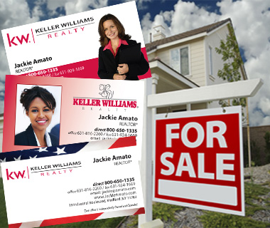
Business Cards: 7 Things to Consider

Real estate business cards might be the tiniest piece of marketing collateral in your arsenal, but they can pack a powerful punch when a contact needs your services. How you design your business card — as well as how you use it in your business — can help you stay top of mind with potential clients.
Here are 7 things real estate agents should consider when designing and using business cards.
Business card design and content
1. Maximize your space — or not
Your business card has just 7 square inches to make an impact on a potential client — that real estate is more precious than an eight-figure mansion, so don’t waste it with distracting tip calculators, cooking substitutions or metric conversions
Make the best use of white space instead. Don’t fill up every millimeter of the card with text or graphics — you’ll overwhelm the contact who won’t know what to retain. Less is more: White space sets apart the most important information and makes it easier to read.
2. Make it classy
If you include graphics other than your logo — or in addition to it — stick with a professional and recent headshot. Omit the cheesy clip art and starbursts declaring how much you love selling. Use a professional designer to create your business card, and a commercial printer who offers high quality paper stock; stick with classic white. Ask someone to edit a proof of your card for typos. Since you take your cards everywhere, store them in a hard case to prevent them from getting dog-eared or stained.
3. Focus on yourself
Use your own information — phone, email, website — on your business card and not your brokerage’s. If you decide to move on, you won’t get any reward for keeping their logo on your card. Plus, you might save the costs of having to reprint it.
Also, remember any copyright and trademark symbols and licensing information that you might be required by law to include on your card.
4. Keep it on brand
There are many trendy colors and typefaces that you can use on your card to make it stand out — and there’s nothing wrong with that as long as your card doesn’t look like a circus ad. It’s easier to stick with the colors and fonts identified with your corporate brand so that your business card looks like part of your family of collateral.
5. Show them where to find you
Most home buyers start their search online, so be sure your website and email address are prominently displayed in addition to your cell phone number. And if you’re active on social media — meaning you consistently offer content that consumers value and comment on — it’s a good idea to include your social media handles on the back of your card.
Business card etiquette
6. Don’t make it a competition
There’s no prize for handing out the most agent business cards. They’re not Mardi Gras beads — they’re two-by-three-and-a-half-inch representations of the professional you are. Use more efficient methods like your website and social media to push your message out to the masses, and keep business cards for one-on-one conversations.
7. Be more of a taker than a giver
Only give your card to someone when asked for it or when you know offering it is the next natural step in your conversation and not just an obligatory gesture. Be selective. Your goal is to collect cards from potential clients, not give out as many as you can to whomever will take one or to use the card as a substitute for conversation — no matter how busy you are.
Real estate business cards are still relevant in a world that’s increasingly digital. They are inexpensive, portable and packed with information a potential client needs to start a relationship with you. Consumers expect professionals to carry a business card, so there’s no reason not to have one. Designed well and used wisely, your business card is a way for you to stay with contacts when the conversation is over.
